This blog post delves into the concept of Gaussian Distribution, a popular topic in mathematics and statistics. The post provides a comprehensive explanation of the distribution, including its properties, applications, and examples. Get to know the secrets behind the famous bell-shaped curve and how it is used in various fields. Whether you are a student, researcher, or data analyst, this post has everything you need to know about Gaussian Distribution.

The Gaussian distribution, also known as the normal distribution, is an essential concept in probability theory and statistics that has widespread applications in many fields, such as economics, finance, and the natural sciences. It is named after the famous mathematician Carl Friedrich Gauss, who introduced the concept in the early 19th century.
The Gaussian distribution is defined by its bell-shaped curve, which is symmetric around its mean and characterized by its mean and standard deviation. Understanding the properties and applications of this distribution is crucial for various statistical and machine learning techniques, making it a fundamental concept in data science.
In this blog post, we will delve deeper into the Gaussian distribution and explore its mathematical definition, properties, and numerous applications. By the end of this post, you will have a solid understanding of this important concept and be equipped to use it in various data analysis tasks.
Probability Density Function (PDF)
The Gaussian distribution is characterized by its probability density function (PDF), which is given by the following formula:
Here, is the mean of the distribution, and is its standard deviation. The formula tells us that the probability density of a value in the distribution is proportional to the distance of from the mean, and inversely proportional to the spread of the distribution. In other words, the probability of finding a value in a given range is higher if that range is closer to the mean and narrower if the standard deviation is small.
The Empirical Rule and the Z-Score
The empirical rule is a statistical rule of thumb that can be used to estimate the proportion of values within a certain number of standard deviations from the mean in a Gaussian distribution. It is also known as the 68-95-99.7 rule or the three-sigma rule.
According to the empirical rule:
- About 68% of the values in a Gaussian distribution will fall within one standard deviation of the mean.
- About 95% of the values will fall within two standard deviations of the mean.
- About 99.7% of the values will fall within three standard deviations of the mean.
The following image shows a Gaussian distribution curve with the empirical rule overlaid:

The green area in the image represents the proportion of values that fall within one standard deviation of the mean, the yellow area represents the proportion of values that fall within two standard deviations of the mean, and the red area represents the proportion of values that fall within three standard deviations of the mean.
To measure how far a value is from the mean in a Gaussian distribution, we can use the z-score, which is a measure of how many standard deviations a value is from the mean. The formula for calculating the z-score is:
Here, is the value being measured, is the mean of the distribution, and is the standard deviation of the distribution. The z-score indicates how many standard deviations a value is above or below the mean of the distribution. For example, if the z-score of a value is 1, it means that is one standard deviation above the mean. If the z-score is -1, it means that is one standard deviation below the mean.
The area under the curve of the Gaussian distribution represents the probability of a value falling within a certain range. The total area under the curve is equal to 1, which means that the sum of the probabilities of all possible outcomes is 1. The area under the curve between two z-scores represents the probability of a value falling between those two values. For instance, the area under the curve between a z-score of -1 and a z-score of 1 represents the probability of a value falling within one standard deviation of the mean, which is approximately 68%. We can use the z-table to find the area under the curve between two z-scores.
Solving an Example Problem
Let’s apply the concepts of the empirical rule and z-score to solve an example problem.
Problem Statement:
Suppose that the weights of a certain population of people follow a Gaussian distribution with a mean of 70 kg and a standard deviation of 5 kg. What is the probability that a randomly selected person from this population weighs between 60 kg and 80 kg?
Solution:
First, we can calculate the z-scores for the weights of kg and kg using the formula:
Next, we can use a z-value table to find the area under the curve between the z-scores of and . From the table, we find that the area under the curve between a z-score of and is approximately .
Therefore, the probability that a randomly selected person from this population weighs between kg and kg is approximately , or .
Using the empirical rule, we can also estimate the proportion of weights that fall within one, two, and three standard deviations from the mean. Since the standard deviation is kg, we can calculate the weight ranges as follows:
- One standard deviation: kg kg kg, kg
- Two standard deviations: kg kg kg, kg
- Three standard deviations: kg kg kg, kg
From the ranges, we can see that the weight range of kg to kg falls within two standard deviations from the mean. Therefore, we would expect approximately of the population to have weights within this range, which agrees with the probability we calculated using z-scores and the z-value table.
Creating a Gaussian Distribution Plot in Python
A Gaussian distribution, also known as a normal distribution, is a probability distribution that is commonly found in nature and statistics. In Python, we can easily generate a Gaussian distribution using the NumPy library and visualize it using Matplotlib.
Here is a step by step guide to creating a Gaussian distribution plot in Python:
Import the required libraries
The first step is to import the necessary libraries, which are numpy{:python} and matplotlib{:python}:
import numpy as np
import matplotlib.pyplot as pltGenerate random data
Next, we can generate some random data from a Gaussian distribution using the numpy.random.normal(){:python} function. This function takes three arguments: the mean, the standard deviation, and the number of data points to generate. For example, to generate 1000 data points with a mean of 0 and a standard deviation of 1, we can use the following code:
data = np.random.normal(0, 1, 1000)Create a histogram
We can create a histogram of the data using the matplotlib.pyplot.hist(){:python} function. This function takes the data as input, as well as some additional optional arguments, such as the number of bins to use for the histogram. Here’s an example of how to create a histogram with 20 bins:
plt.hist(data, bins=20, density=True, alpha=0.6)In this code, the density=True{:python} argument means that the histogram will be normalized to represent a probability distribution, and the alpha=0.6{:python} argument means that the bars in the histogram will be slightly transparent.
Create a Gaussian distribution plot
To plot a smooth bell curve that fits the histogram, we can use the numpy{:python} and matplotlib{:python} libraries to calculate and plot a probability density function (PDF) for the Gaussian distribution. Here’s an example of how to do this:
# Calculate the mean and standard deviation of the data
mu, std = np.mean(data), np.std(data)

# Create an array of x-values ranging from mu - 4*std to mu + 4*std
x = np.linspace(mu - 4*std, mu + 4*std, 100)

# Calculate the PDF for the Gaussian distribution using the x-values, mean, and standard deviation
pdf = 1/(std * np.sqrt(2 * np.pi)) * np.exp(- (x - mu)**2 / (2 * std**2))

# Plot the PDF as a line on top of the histogram
plt.plot(x, pdf, color='red')
In this code, the np.linspace(){:python} function creates an array of x-values ranging from 4 standard deviations below the mean to 4 standard deviations above the mean, and the pdf{:python} variable is calculated using the formula for the Gaussian probability density function. Finally, the plt.plot(){:python} function is used to plot the PDF as a red line on top of the histogram.
Add labels and show the plot
Finally, we can add labels to the plot and show it using the matplotlib.pyplot.xlabel(){:python}, matplotlib.pyplot.ylabel(){:python}, and matplotlib.pyplot.show(){:python} functions:
plt.xlabel('Data')
plt.ylabel('Probability Density')
plt.title('Histogram of Random Data with Fitted Gaussian Distribution Curve')
plt.show()
Putting it all together, the complete code to generate a Gaussian distribution plot in Python looks like this:
import numpy as np
import matplotlib.pyplot as plt

# Generate random data from a Gaussian distribution
data = np.random.normal(0, 1, 1000)

# Create a histogram of the data
plt.hist(data, bins=20, density=True, alpha=0.6)

# Calculate the mean and standard deviation of the data
mu, std = np.mean(data), np.std(data)

# Create an array of x-values ranging from mu - 4*std to mu + 4*std
x = np.linspace(mu - 4*std, mu + 4*std, 100)

# Calculate the PDF for the Gaussian distribution using the x-values, mean, and standard deviation
pdf = 1/(std * np.sqrt(2 * np.pi)) * np.exp(- (x - mu)**2 / (2 * std**2))

# Plot the PDF as a line on top of the histogram
plt.plot(x, pdf, color='red')

# Add labels and show the plot
plt.xlabel('Data')
plt.ylabel('Probability Density')
plt.title('Histogram of Random Data with Fitted Gaussian Curve')
plt.show()
When you run this code, it will generate a plot that shows the histogram of the random sample, along with a smooth bell-shaped curve that represents the probability density function of the Gaussian distribution:
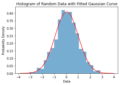
This graph is a useful visual representation of a Gaussian distribution, and can be used to better understand the properties of this type of distribution.
Properties of the Gaussian Distribution
The Gaussian distribution has several important properties:
- Symmetry: The Gaussian distribution is symmetric around its mean, which means that the left and right sides of the curve are mirror images of each other.
- Unimodality: The Gaussian distribution has only one peak, so it is referred to as a unimodal distribution.
- Asymptotic: The Gaussian distribution approaches as approaches infinity or negative infinity.
- Normalization: The Gaussian distribution integrates to over the entire real line, which means that the total area under the curve is equal to .
- Characterized by mean and standard deviation: The Gaussian distribution is completely characterized by its mean and standard deviation.
Using Gaussian Distribution in Real-World Applications
The Gaussian Distribution is used in many real-world applications, including:
- Image Processing: Gaussian Distribution is used in image processing to filter out noise from images.
- Data Analysis: Gaussian Distribution is used in data analysis to describe the distribution of data and to make predictions about future data.
- Machine Learning: Gaussian Distribution is used in machine learning algorithms, such as Gaussian Naive Bayes and Gaussian Mixture Models, to model the distribution of data and make predictions.
- Weather Prediction: Gaussian Distribution is used in weather prediction to model the distribution of temperature and precipitation in a given region.
Conclusion
In this article, we learned about the Gaussian Distribution, which is a continuous probability distribution that is symmetric, unimodal, and characterized by its mean and standard deviation. We also learned how to generate a Gaussian Distribution plot in Python using the numpy{:python} and matplotlib{:python} libraries, and we learned about some of the real-world applications of the Gaussian Distribution. Thank you for reading!